
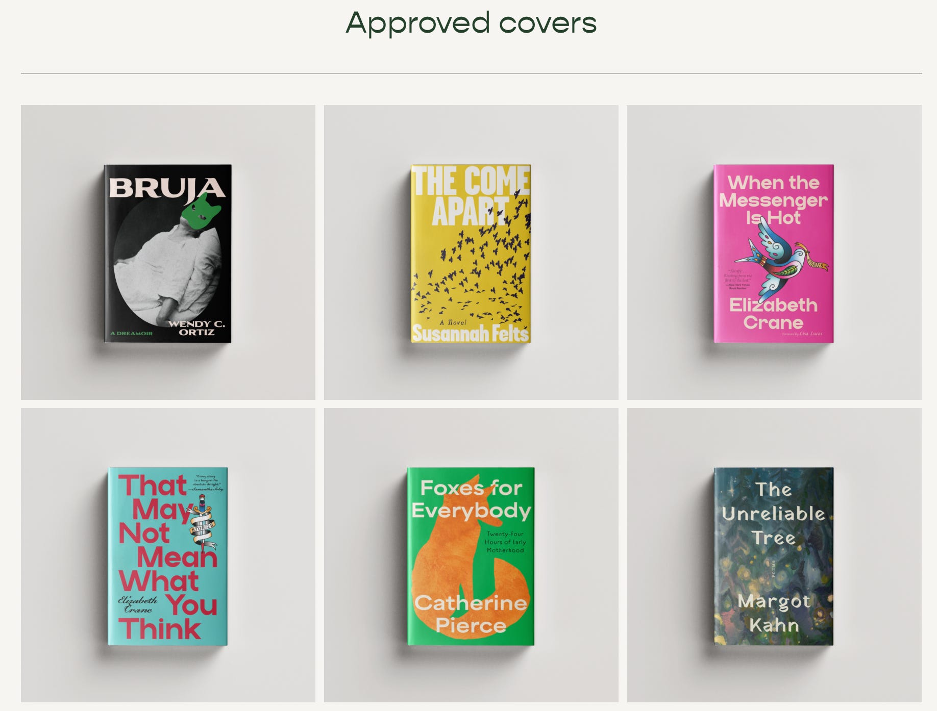
Galley Brag #25
Brilliant cover designers Joanne O'Neill and Olivia McGiff on UK vs. US cover discourse, how to protect your art (and your self!), and staying humble.

EK: Just to start off, do you both wanna introduce yourself and your roles in the publishing ecosystem?
JO: I can go first: I’m Jo. I’m a Senior Art Director at Amazon Publishing as of about five months ago. And previous to that I was at HarperCollins with Olivia for eleven years.
OM: And I’m Olivia! I am a newly anointed Assistant Art Director at HarperCollins and also the illustrator and co-author of two cocktail books.
EK: Woohoo! Well, so I feel like I have gotten some hate in the comments…
OM: —aka me DMing you…
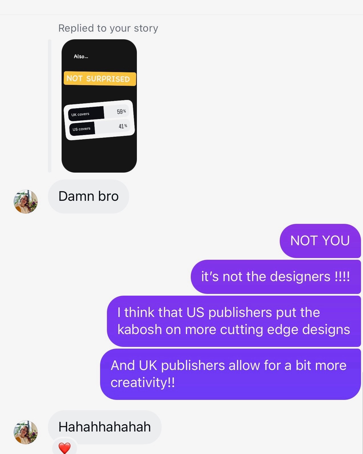
EK: Well, I’ve talked to a lot of people about the UK versus US covers; people are always comparing which one is better, but obviously the two are such different markets. I’m very curious about your thoughts on why the covers tend to be so different?
JO: It’s funny that you mentioned the comparison thing, ‘cause that’s probably one of my pet peeves. Having visible work out in the world is certainly a privilege. Like, to see your work in a bookstore, that’s a lovely feeling, but it does also mean you have to accept that it will be scrutinized.
But the comparison thing I do find quite frustrating; of course you’re allowed to enjoy one cover more than the other. It’s all subjective. But I think because it’s so out of context—like, a JPEG on a book cover on Instagram is already out of context; that’s not how it’s supposed to exist in its final form—people are comparing them to each other instead of looking at how they are best suited to different markets.
Like, it’s a commercial product. It’s like, okay, so you like one more than the other? Well, I like this pizza more than that pizza. What’s the value of that, really? I mean, maybe it’s just for fun and clicks and that’s fine. But how do you feel about that, Olivia? I’m curious what you think.
OM: I feel like when I see two covers that are so different from each other, it just makes me think about the different teams that were working on them: how many voices were in the room and what was the purpose of the cover for each team? Sometimes I’ll look at the UK cover and be like, damn, how did they get that approved? Like, this cover is so cool, but that type is illegible. <laughs>
It can be really delightful to see a UK cover and know that the designer probably had a lot of fun making it. Sometimes I’ll see a UK cover and be like, wow, I would’ve loved to make something more like that, but, oftentimes, we have so many voices in the room from sales to marketing to whatever merch account that wants to pick it up but doesn’t want blood on the cover, or whatever.
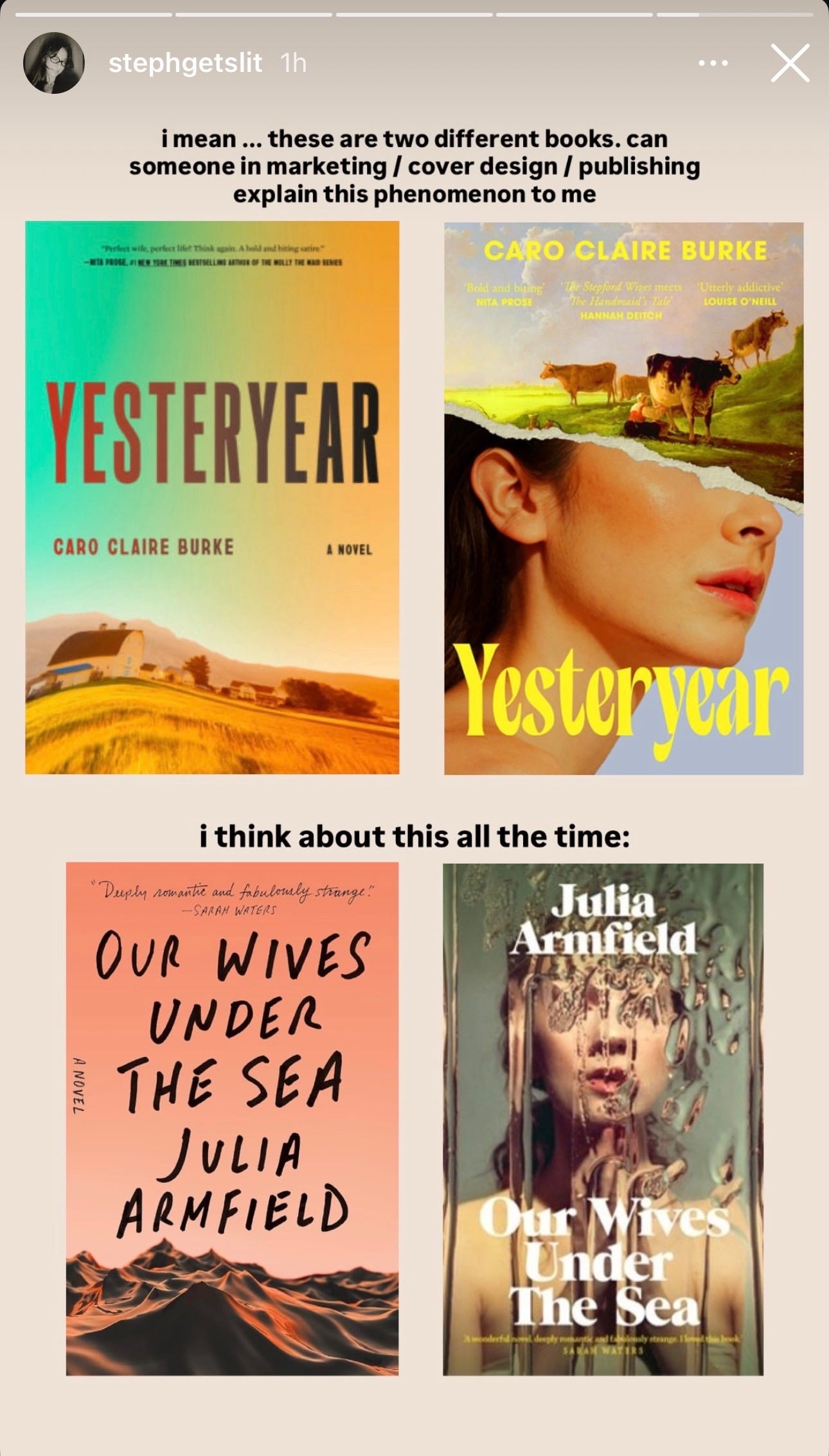
OM: So, it just makes me think about how different the goals and the teams are on each side. Last year I was in the UK, and I went into a bookstore and was talking with the bookseller about a book that Jo had recently designed. The bookseller was like, oh, I love the US cover. I literally have to handsell the UK version because it’s so not descriptive of what the book actually is.
It was just funny hearing that UK booksellers are also aware of these differences. Sometimes the more wild UK covers are not actually conveying what the book is; it’s not marketing it properly. But that’s just one example….
EK: I mean, now I have so many more questions to ask you. <laughs> Jo, it’s really interesting for you to talk about the context of the book cover, because obviously the book cover needs to translate to a small JPEG, and—depending on the genre—you might be thinking more and more about how the cover appears online. But a book’s primary format is often as a physical object. So even that JPEG is already taken out of context.
And then, there is the context of the bookstore itself. If you’re in a UK bookstore, the book covers are going to reflect that UK market and fit within a particular style. But—if you were to walk into a US bookstore and see a UK cover on a front table—it might stick out in a very different way, and you might not have the same reader response to the book that you’d have if it had the US jacket.
JO: Like Olivia was saying, I think it probably all comes down to the different tastes of the market. And then probably budget, too. Like we’re splashing the cash, getting original artwork created and licensing all these old paintings. I haven’t worked in a UK art department so I can’t speak to the particulars, but I don’t know that they have that kind of budget in the UK.
Something else I was thinking about this morning is the fact that, in the UK, all the major supermarkets carry books—or at least like, the top-twenty paperbacks, cookbooks, or whatever. So, you’re encountering books far more often than you would in the US. Obviously in the US we have Costco and Target selling books, but I think there’s something to be said about the visibility of books in a place like a grocery store. They’re just different markets.
EK: Totally. Olivia, I know you were talking about the number of voices in a room during positioning—do you think, in the US, there tend to be more voices in the room because of the way that our retail distribution works? I mean, I know you’re not a designer in the UK, but I’m just curious about how the larger feedback rooms come into play.
OM: I mean, I think we have to put a little bit of an asterisk on “in the US,” because we’re talking from the perspective of working for a Big Five and working for—at least at Harper—a flagship imprint of a Big Five. There are plenty of publishing houses in the US that would have different dynamics in terms of how they’re getting things approved and how many voices are in the room for cover approvals. We’re juggling a lot of priorities with cover design, and I’ve sometimes found that—when a book is less on a publisher’s radar—you as a designer actually get to have more fun with it because there’s not as much input from sales and marketing in the room.
EK: That makes total sense. Obviously, as an editor, you always want your book to be high priority, but it’s also very true that when a book has everything riding on it, it’s gonna be dissected to death by a million people.
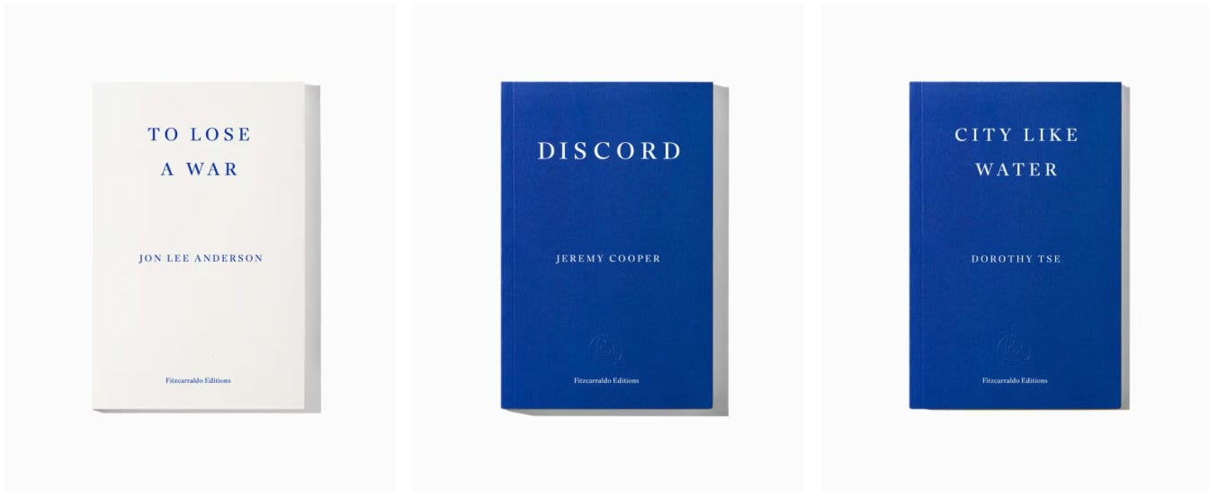
I mean, this kind of goes back to the UK conversation, too, but I’m curious how you feel about the presses that eschew cover design entirely, like Fitzcarraldo Editions or And Other Stories where there is a consistent style across the entire publisher or imprint? It’s obviously a different market and a lot of these are UK-based, but even New York Review Books carries a particular style across all those reissues. I’m curious about your thoughts and whether you think that would work in the US at all?
OM: Hmm...
JO: I’m thinking…
EK: You don’t have to have the perfect answer...
OM: Okay, I think that my understanding with those covers is that it’s entirely about branding for the imprint. So, I don’t know if, as a cover designer, I can actually have any opinion on it’s effectiveness because it actually doesn’t have to do with the cover design.
In the US, I think there are plenty of publishers who have their specific serieses that they release every year where they are repackaging classics and the like. And I think those work because readers are excited to see what the new series will be. Most designers are also excited to work on projects like that because it’s fun to have limitations and to work within a framework.
JO: It also makes me think about 831 Stories, and how they have no covers…
EK: Oh, yeah!
JO: That’s so interesting to me. Like, it’s so appealing. Even though it’s like, putting me out of a job. <laughs>
EK: I haven’t read any yet, but I’m an admirer of theirs because of the branding and also because I think we need to be publishing more novellas and short books in general. My local bookstore had a big display of them for Valentine’s Day and I was very tempted…
JO: Yeah, and you wouldn’t want all your books to look like that because what makes them stand out is the fact that they do look so different from everything else.
EK: I mean, obviously it’s such a branding thing, but we can also talk about how a lot of covers slowly start to look the same across a particular genre–whether that’s intentional or unintentional. I keep thinking about the romance genre where it’s either the Kindle Unlimited stock photos of abs and bodice rippers or the very flat, sexless, cartoonish covers. And then I feel like there’s been one or two other series with cowboy romances or whatever where there’s a bit more of a fleshed-out cartoon style, so it’s interesting to see a publisher like 831 that breaks from that entirely.
JO: Yeah, and maybe the brand is overshadowing the books as well, ‘cause it is such a brand. I know nothing about any of these books; all I can really glean from the covers is the title, and I would have no context for the fact that it is a romance if I didn’t already know that.
But the style thing is interesting—the blurring of the lines between like, this is a women’s fiction book but it’s also a bit romantic, so it maybe should have these illustrated people, but how far can you push the style before it crosses entirely into the romance genre? It’s nuanced. Sorry, Olivia, I felt you were gonna say something…
OM: No, I totally agree with you. I think there are certain genres that are very driven by the market trend and signaling to the reader that this book is like this other book that you loved. I think romance and thrillers are two genres that have to work within a lot of those market limitations. Obviously, there are designers who do it so, so well and are able to innovate within that known look and make you feel like you’re not picking up the same book every time, but there are plenty of times when we’re given a brief to make something look as close as possible to an existing book. And I’m always so impressed when genre designers are able to innovate within a very limited system.
EK: Yeah, one of my good friends and former roommates Colleen has been a cover designer for Berkley for over ten years, so she’s mostly only done romance covers. I need to talk to her about this! Even within those illustration styles we’ve talked about, there’s such a wide, complex range of how you signal things to readers, and—
JO: …the message that it sends. Yeah, like, what kind of readers are you trying to grab with this particular style?
EK: I also feel like there’s been this conversation about the sexlessness of romance covers now with the cartoonish covers where it almost skews into YA for me.
OM: I mean… <Olivia holds up a copy of Heated Rivalry>
EK: Okay, well originally it seems like it had the sorta Kindle Unlimited-style cover with the abs or whatever, and then it became the cartoon. Like, can we split the difference there?
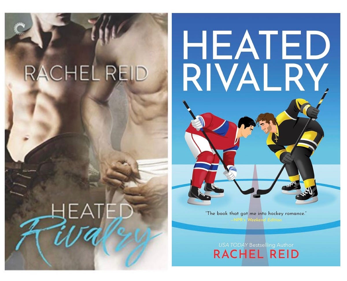
JO: I was gonna say, that’s the only option: sexy cartoon
OM: <laugh>. Well, yeah. I think the very flat cartoon style—and there are designers and art directors who could better speak to this, because Jo and I don’t work as much with this type of book—but I feel like that trend is on its way out. The newer trend cropping up now on romance covers is a little bit more textured. The characters are taking up more space on the covers. I really dislike that trend.
EK: The flat cartoon or the new one?
OM: The new—I mean, I didn’t really like the flat cartoon, either. Obviously it’s worked for the market and that’s the goal, but as an illustrator and book reader, I don’t enjoy it.
But I do think the textured illustrations are actually trying to bridge the gap between the illustrated and the Fabio look. Because there’s more sex in them, but it’s still palatable for the audience that’s more comfortable with illustration.
EK: Yeah, I didn’t even think about whether the characters were in the foreground or not; it does seem like the flatter illustrations are just one piece of a larger cover that is much more focused on conveying a setting or overall vibe than the physicality of the characters themselves, which does leave more to the imagination…
Surprise!! Brief Q&A with my friend Colleen Reinhart who is a brilliant designer at Berkley <3
EK: How have you seen the “flat cartoon” romance style evolve, and what do you think are its origins?
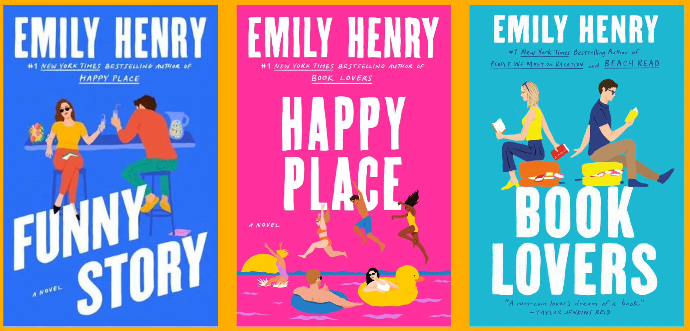
CR: Within Berkley—the imprint I work for—the current romance covers became popular when Cindy Hwang championed a different look for romances to help signal that the stories we were publishing were going to be less “traditional” romance.
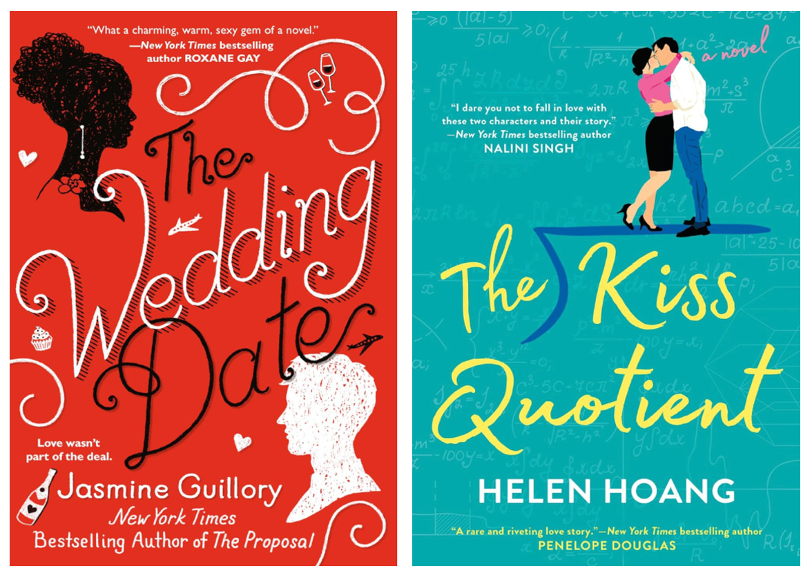
The Wedding Date by Jasmine Guillory, which Vikki Chu illustrated, and The Kiss Quotient by Helen Hoang, which I illustrated, both came out in 2018. Obviously, illustrated book covers existed before then but that is when I noticed a large uptick.
EK: How has romance cover design evolved over the 10+ years that you’ve been doing it? Where do you think it’s going?
CR: Like any trend, once there is a certain saturation point, what once felt unique can start to feel expected, which means authors and editors will start wanting to see different styles of illustration.
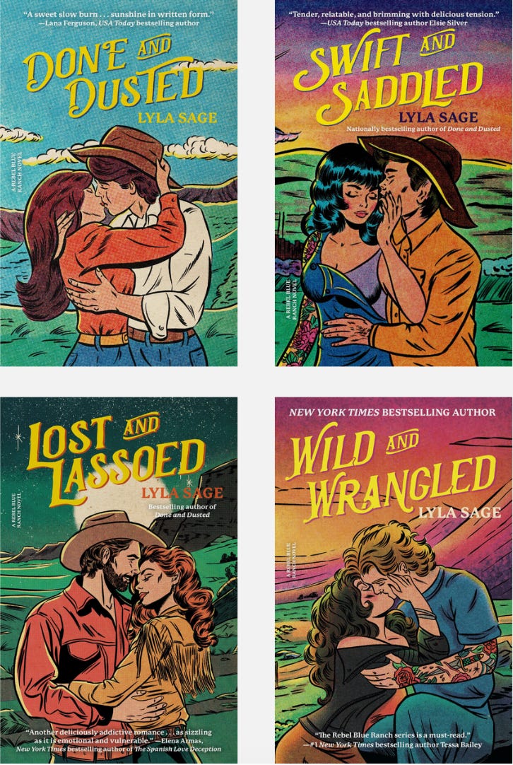
There is now more room for varying art styles, for example the retro illustration styles that Austin Drake does for Lyla Sage’s covers are hugely popular and have changed the way cowboy romances look.
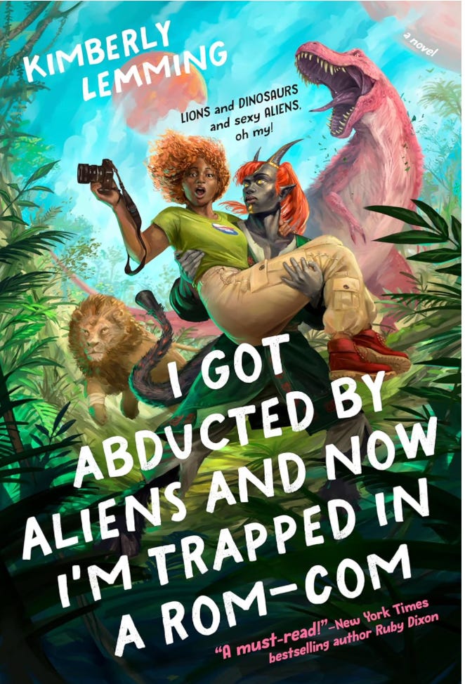
I hope that illustrated romance is here to stay since it can also capture the totally fun and bonkers premise of certain romances (like Mike Pape’s illustration for Kimberly Lemming’s I Got Abducted by Aliens and Now I’m Trapped in a Rom-Com) in a way that photography can’t.
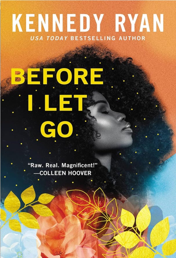
Of course, trends are trends and photo covers now stand out against the illustrated ones and designers are coming up with ways to make these photographic covers feel different than they did in the past, like what Daniela Medina did for Kennedy Ryan’s book Before I Let Go.
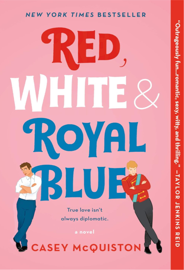
Okay—I also have to brag on Colleen for a sec just to say that she also illustrated the Red, White, & Royal Blue cover….ever heard of it? okay, now back to the main event!
<3 <3 <3 <3<3 <3 <3 <3<3 <3 <3 <3<3 <3 <3 <3<3 <3 <3 <3<3 <3 <3 <3<3 <3 <3 <3
EK: I’m gonna ask you one more question on this topic, even though I know this is not your level of expertise. You mentioned it was really fun as a designer to have constraints when doing a series of repackaged classics or when you’re iterating within a brand or particular genre classification. But how do you innovate within that? You mentioned that there are some designers that manage to really break from the pack while still signaling a particular genre—how do you iterate off of something that’s been done a million times while still making it look new? It feels like such a hard, thin line to walk…
JO: That’s a good question actually. That’s hard to quantify, ‘cause if someone puts Gone Girl on your cover brief, you do sort of feel like you start from that place rather than starting from scratch with the book itself; it does kinda box you in in an almost subconscious way. Like, it’s gonna…
EK: —it’s gonna influence.
JO: Yeah, you’re influenced by that. And I think that’s a bit of a hindrance often, too. But to answer your actual question, it’s tough. You just have to keep making stuff until it doesn’t look too close.
OM: When we show that first round of cover options to the publishing team, we are often showing anywhere from five to ten covers. And then—if we want to innovate—it’s up to us to give them what they want and also give them options that are not exactly what they want; that are more designer-driven or inspired by the read or our understanding of the book. And then, ultimately, it’s up to those voices in the room to decide whether they want to trust in that new vision or rely on what’s already working.
JO: And sometimes they don’t look that different. Like, I feel like I’ve seen commentary on social media where someone will say, why does this cover look exactly like X? As if the people who made the decisions didn’t realize that. And it’s like, no, the whole idea is to capture you twice. So, sometimes it maybe should look similar.
EK: Yeah, obviously within the thrillers and rom-com genres, there’s going to be more limitations or expectations around the covers, but do you feel like, with literary or upmarket book-club books, there’s more freedom to play around and experiment? Or do you feel like it’s just a different style that’s a little bit less obvious for the layperson to immediately recognize.
OM: I do think there’s more freedom and wiggle room with those types of books. The literary fiction books are the ones where there’s more of a possibility of the editor saying, read this and see what you think. I mean, I don’t work in marketing or publicity, but I would suspect that those type of genre books rely more on signaling to a reader the specifics of the plot and what makes it unique as opposed to, with literary books, you have to do a little bit more work to convince a reader that this is the book that you should pick up.
The romcom and thriller readerships just fly through books. They’re reading and buying so many more books a year that you don’t necessarily need to sell someone on the specific book. You just need to give them their next fix.
JO: <laugh> Yeah.
EK: Versus people that are buying, like, “capital F fiction.” Either they are snootier or they are—
JO: —yeah, I was gonna say that, too. <laughs>
EK: It takes you longer to read the book so it takes you longer to buy the next book? So, if someone’s a big romance or thriller reader, they’re probably going through things pretty quickly, or they at least know what they like. I think what’s interesting about the romance and thriller fanbase is that they’re a bit more trope-based. Readers are more likely to be like, oh I love this book, so I wanna find another enemies-to-lovers book. Versus, with literary books—especially debuts—there seems to be a little more discoverability with that readership. So, sometimes it does rely more on a cover catching someone’s eye and sparking interest than expressly communicating what the book is about.
JO: And when it comes to design, it’s interesting to think about that kind of stuff, too. If you are designing something more literary—like you were saying, Olivia—you don’t have to signal as literally or as loudly; you can be a bit more experimental and a bit more loose. I don’t know anything about marketing or what customer buys what, but I would be curious to learn more about the kind of person that’s picking up one thing versus the other and why they are picking that up and what it means to be someone who flies through romance books vs the FSG catalog. I’m being incoherent, but anyway…
OM: Jo, you’re perfect.
EK: Agreed! Just to just to move on, Olivia you are a very talented, gorgeous illustrator, and Jo, you are an accomplished artist and graphic designer in your own right. I’m curious about how your personal art practices influence how you approach cover design, or whether you feel like you have to completely put that influence aside?
JO: I’ll let Olivia go first because Olivia jumps around more from analog to digital, and I’m curious for your answer, ‘cause I don’t really do that at all.
OM: Yeah, I feel like—at least for my in-house work—the question is more like, when is the right time to bring my own practice into the conversation? When is the appropriate time to do that? I think because we work between so many different genres, I enjoy the ability to shapeshift and work on different looks. And then when I get assigned a book where I can see that it would be useful for myself and the whole team to do an original illustration, I’m so excited to do it, but it also means that I’m bringing my heart into it a little bit more.
OM: My job as a designer and art director is to not be emotionally involved in what the final cover will ultimately be. I really am so appreciative of being a part of a team that encourages me to contribute in that way, but also encourages me to protect myself from offering it up too much; ‘cause it takes time, and you don’t get paid extra for that work. And I also don’t ever wanna put the team into an awkward situation where they wanna reject something but feel like my feelings are too involved.
I feel like I’ve gotten better and better at threading that needle of when it’s best suited to bring in my own practice. And—like you were saying, Jo—I work both in paint illustration and also digital. So, I’ve found that digital illustration is kinda an easier way for me to bring my practice into the room without having it feel like it’s part of my soul.
Like, as soon as I bring those paints out, it’s over for me. I’ve committed fully to that book; I’ve read that entire book; I’m deeply invested. There’s something about digital illustration that allows me to feel more like I do when I’m just working in Photoshop on a type-driven cover.
EK: Yeah, that’s so interesting. Did I make up that your dad actually painted one of your book covers?
OM: Yeah, both of my parents are artists, and my dad is a painter. He provided the painting for the paperback cover of Pete and Alice in Maine. And I didn’t disclose—I mean, I disclosed this to Jo just to make sure that it wasn’t illegal that I was doing this—I didn’t tell the publishing team that it was my dad’s work. I just let them choose.
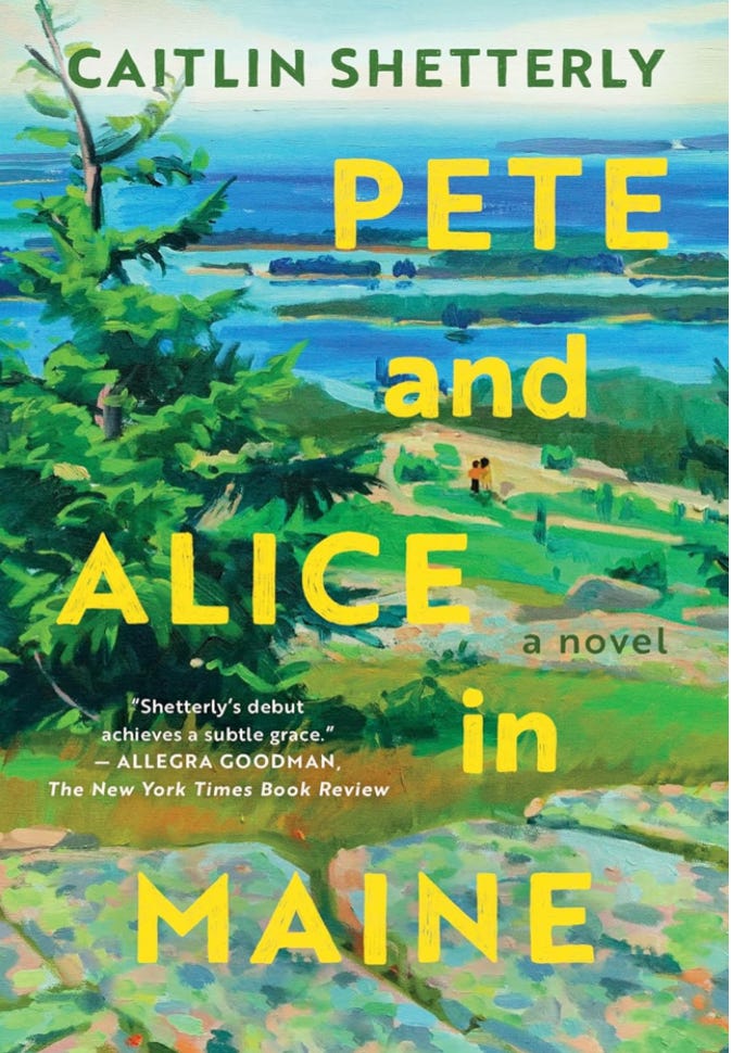
EK: After, or ever?
OM: I told them after it was approved and finalized and everything. I just didn’t want them to feel like they had to choose something that I had an affinity for. But the fact that it worked out was so sweet and lovely.
JO: It looks amazing, too.
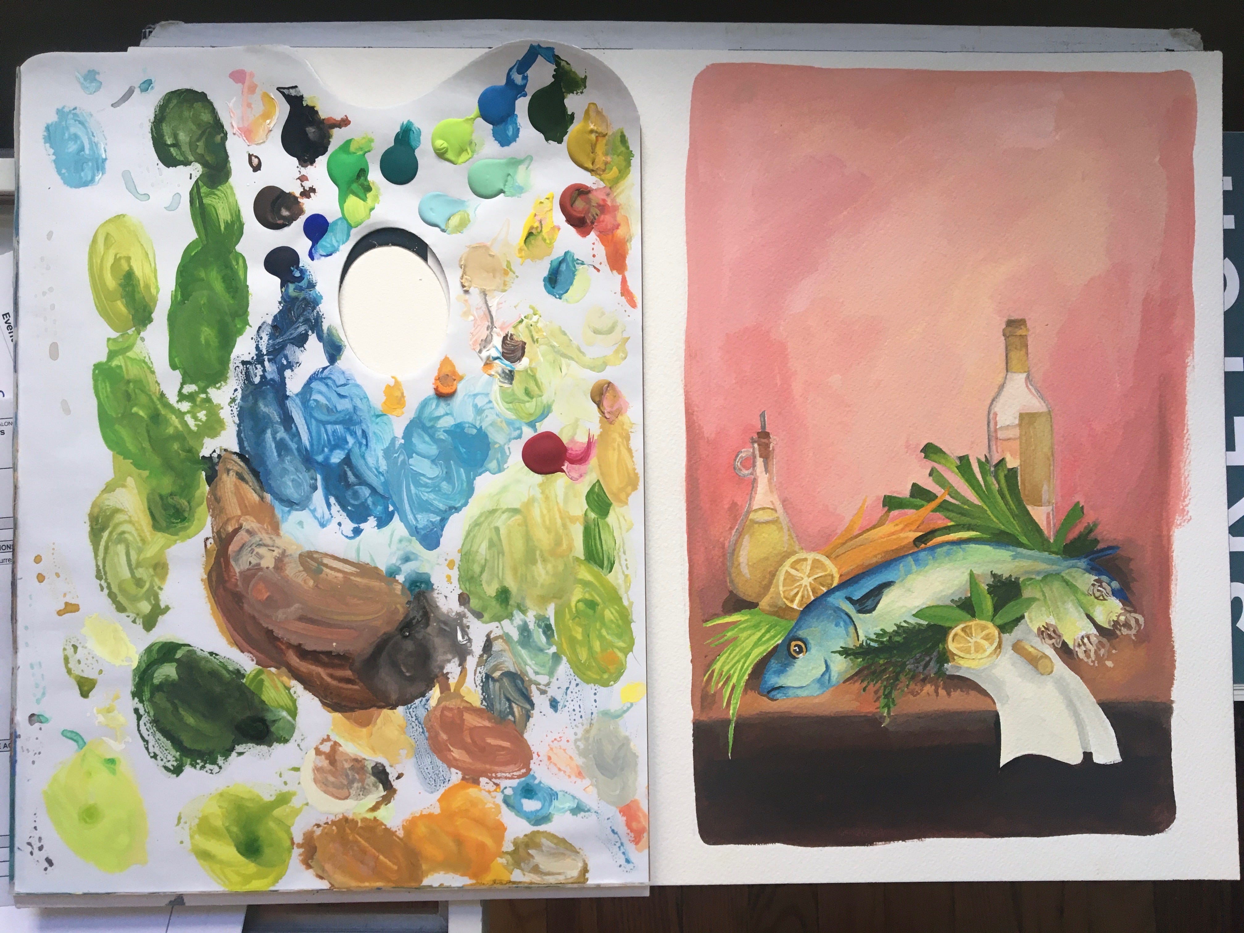
EK: It’s also funny—I was thinking about this earlier—literally the first ever book at Harper that I was the editor on was a book that you painted, Olivia…
OM: —and that Jo designed!
EK: And that Jo designed! The backlist reissue of The Alice B. Toklas Cook Book.
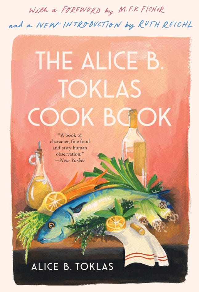
JO: —and now I have that painting. Olivia, you gave me that painting, and now I have it in my kitchen. <laughs>
EK: It is so beautiful, as a piece of actual art.
OM: That was pretty early on…I had just started as a cover designer…
EK: When did you start?
OM: I joined Harper in January 2020.
EK: Oh, after me? That’s so funny! I had no idea.
OM: Yeah, just by a bit. But I knew that it was not chill for me to propose to Jo that I wanted to work on this cover, ‘cause I was coming in as an assistant designer. So, I felt like I took a long time crafting this very kind of, no worries if not, I just wanna offer, but you don’t have to use it, blah, blah, blah kinda email…
EK: Cute!!
OM: And just said like, if I could possibly paint something for you to maybe consider? And then she was so nice and did the most beautiful job with it, and the fact that that’s what got approved is kinda hilarious now in retrospect, knowing how difficult it is to get things approved sometimes. <laughs>
JO: Yeah, that really set the wrong precedent <laughs>...
EK: I’m sure you can sometimes suspect from the jump that the cover process is going to drag on forever—like, if the editor or author is someone with a lot of opinions, or if the book itself is focused on a tricky subject or genre-blend—but it is so crazy to sometimes have books where it’s one round, no tweaks. Like, here it is. Everyone’s on board; that was easy. And, other times, we’ll be so many rounds in that everyone’s getting really upset…
OM: —and has lost the plot. Like, what are we even talking about anymore?
EK: Exactly! Yeah, it is so interesting how wide-spanning it is; sometimes it is something you can anticipate and sometimes it’s like, why are we still deciding on this cover? <laughs> Like, this doesn’t make any sense anymore, you know?
JO: Yeah, happens more often than not, I fear. <laugh> I was just gonna say—to your point Olivia—about putting yourself into the design; I mean, no matter what medium you’re designing in, I feel like you’re always putting yourself into it. And that’s what’s interesting about having a job that requires your own creativity and your own taste or perspective on something; you just have to accept the criticism that might come with that, or what it might take from you or your own practice.
Like, for me it’s a very blurred line. I’m only working in one medium—I’m only working in digital—and if I’m doing this kind of work outside of my job, it’s probably not anything that different. And so, it’s a very blurred line, for better or for worse. So, I think it does inform—in kinda a cyclical way—like, I’m working on this in-house, and then I might be working on something for myself, and then, maybe I’m really into this typeface, so maybe I’ll also use it over here.
It’s such a mishmash. I think it’s nice, Olivia, that you have a bit of a built-in boundary; if the screen creates the boundary in that way, I think that’s really healthy and helpful. Like, Olivia and I have been doing life drawing here and there, and I’m not confident in it, but it kinda reinvigorates you just to do something else…
OM: …and not having to present a finished product, also. Which is soo nice.
JO: –which is difficult for me. <laughs>
OM: Yeah, even with the first round of covers, you have to be ready for the possibility that the team could choose any one of those covers and then it’s over.
EK: –and then you’re like, actually wait, just kidding! That was not my best…
OM: Yeah, you’re kinda always pretending that you know what you’re talking about. Like, of course these ten are all fully finished covers...
JO: I struggle though, without the boundary. ‘Cause I’m so used to it being like, here’s your brief, it’s 6 x 9, etc, etc.. And then, when someone takes away the boundaries, it’s like, I dunno what to do with myself. I find that quite challenging, so maybe that’s a sign that it’s something I should do more of.
OM: I feel like, Jo, that speaks to the fact that you gave yourself such a specific brief with your creative project doing the Blink-182 poster designs.
JO: Yeah, that’s true <laughs>. But then it all came back around and became a book cover, too.
EK: Yes! Tell us the story. Tell us, tell us, tell us!
JO: <laughs> You know the story.
EK: No, I’m not sure if I know all of the points. I mean, obviously I know about the poster project, but I want to hear more from your lips <laughs>.
JO: …the horse’s mouth… <laughs> Well, I’ll start with the poster stuff. That was just something I was doing—well, I’ve since gotten lazy and stopped doing it—but I started doing it in 2019 ‘cause I was making stuff at work that I liked, but the more funky stuff I wanted to try and do didn’t really make any sense in the context of a book project. Like, Olivia, I’m sure you’ve had this happen to you as well, but sometimes there are crazy typefaces you wanna use or you’re just working in a style that doesn’t really translate to a book cover or whatever it might be.
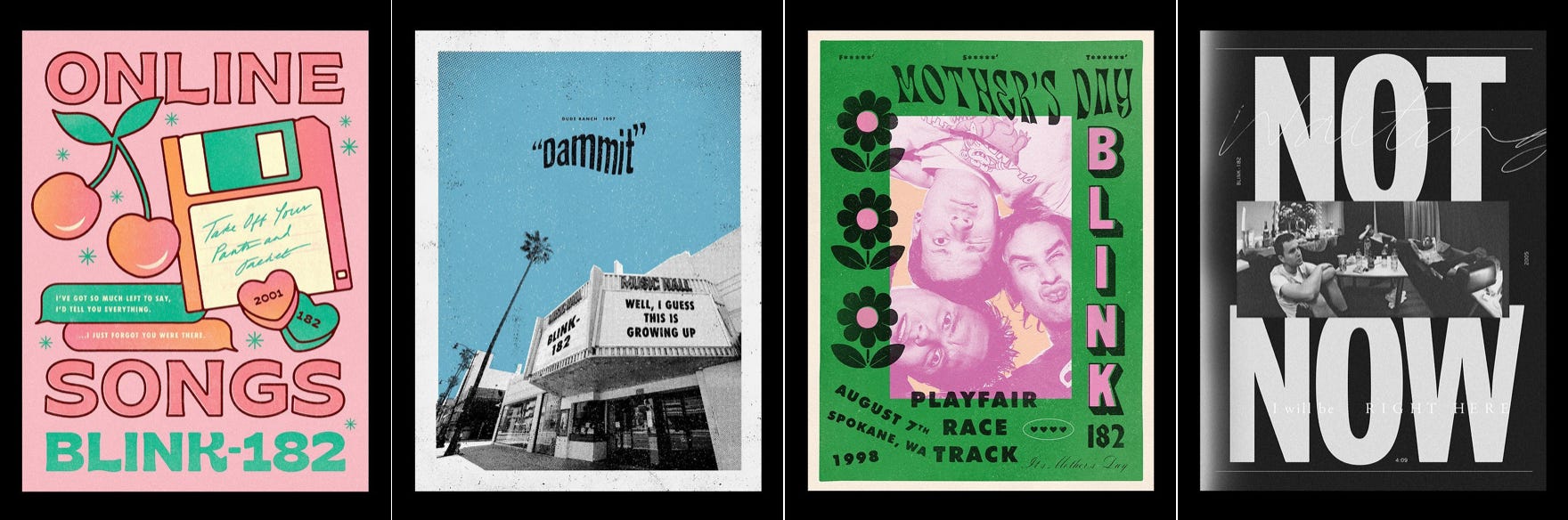
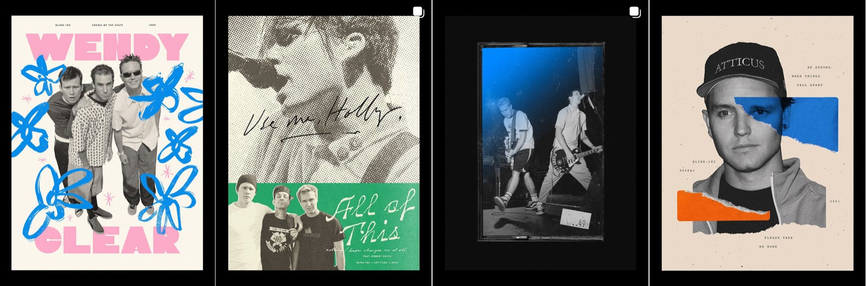
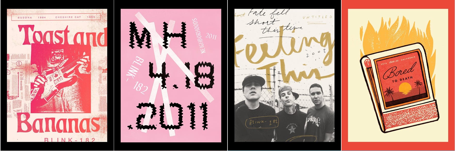
JO: So, I was just making them for fun and that went on for a couple years and then I don’t know what happened to it; it kinda died slowly. But then one of the members of the band was writing a memoir, and I figured out it was being published by an imprint of Harper, where I was working at the time. And long story short, I ended up designing the cover, and I think doing those posters really allowed me to find my own style of working.
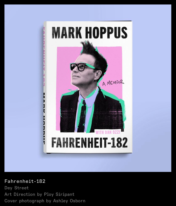
JO: I think I had worked at Harper for maybe five years at that point, and that was around the time that I really was like, okay, this is the kind of work I wanna make, and I was finding that I could get it approved. Like, I’d sort of been able to marry the commercial-ness of Harper with the stuff that I wanted to do. Not always like—of course, there are constraints here—but I think I found my voice through making that stuff by myself. So, all that to say, when that project came around, I felt very prepared for it. And yeah. Bestseller.
EK: I love that.
OM: As a #1 Jo Stan, I just have to say that she’s being very casual about all this…
EK: I was gonna say!
JO: I mean, everyone’s bored of hearing me talk about it <laughs>.
EK: Nooo, that is not true. This is for people who’ve never had the amazing opportunity to hear from you….
OM: Yeah, this is not just the three of us.
EK: I know you’re used to being behind the scenes, but you actually have to talk about yourself. Sorry!
JO: I know. It sucks to talk about myself, but I’m trying my best. Oh my God, what else can I tell you about it? I guess that’s kind of it.
Well, one of your questions was like: what’s your dream project? And I kinda have done it. So, now what? I guess I gotta find another dream...
OM: You have to become a fangirl of a new band…
JO: <laughs>
EK: Obviously we’re talking about the vulnerability of different art mediums and the vulnerability of putting your art out there to be dissected—not only by the public, but also by people who don’t know anything about art or design.
I’m curious about how you protect yourself? How do you deal with having to constantly put your art out to be critiqued by people who sometimes don’t even know what they’re talking about at all? How do you still protect your creativity and passion for the creative process while still thickening your emotional wall so you don’t feel like you’re on trial by fire every week?
JO: I think it’s learned, unless you wake up and are born with a massive ego and think your work is amazing and criticism doesn’t affect you. I remember being in art school when you’d put your work up on the wall and be so nervous about what people would say about it…you just have to remember that there is a separation. Like, you’re reacting to something; you’re reacting to a brief. It doesn’t represent you, even though it’s your work.
Like, it does, but—at the same time—you’re trying to represent someone else’s work. So, it’s a very meta, complicated feeling. But I just think you have to not take it personally; it takes time to develop that understanding.
OM: I also think it gets easier the more you understand how many voices there are in the room and why they’re in the room. Like, there are plenty of times where I’ll show a suite of covers and I know which one is the correct cover that they should choose, and they end up choosing the one that is bananas that I did in the last, like, ten minutes before the meeting. And that just shows me that I actually don’t have all the answers, or any of the answers. Like, what is the goal here? What are we doing?
And also just acknowledging the fact that sometimes a cover isn’t chosen because that editor doesn’t like the color purple or doesn’t like feet on the cover. Like, it can be so random.
It’s all so subjective, so I feel like the more I’m able to understand that this is so not about me—
JO: Yeah, exactly. That’s how I would phrase it, too.
OM: And then—if something silly happens—I just gotta take that as a win that something made me giggle at work today. Like, someone sending in a scarf and asking us if we could color match it…
EK: Did that happen, actually?
OM: Yeah, so it’s useful for me to see that stuff as just fun <laughs>.
JO: Yeah, and also just taking enjoyment in the process and trying to forget you’re at work and be like, I’m making this for myself and I derive satisfaction from the making of it. I still have the thing. I can still look at the thing. It’s gonna go on a book tomorrow and go into a store.
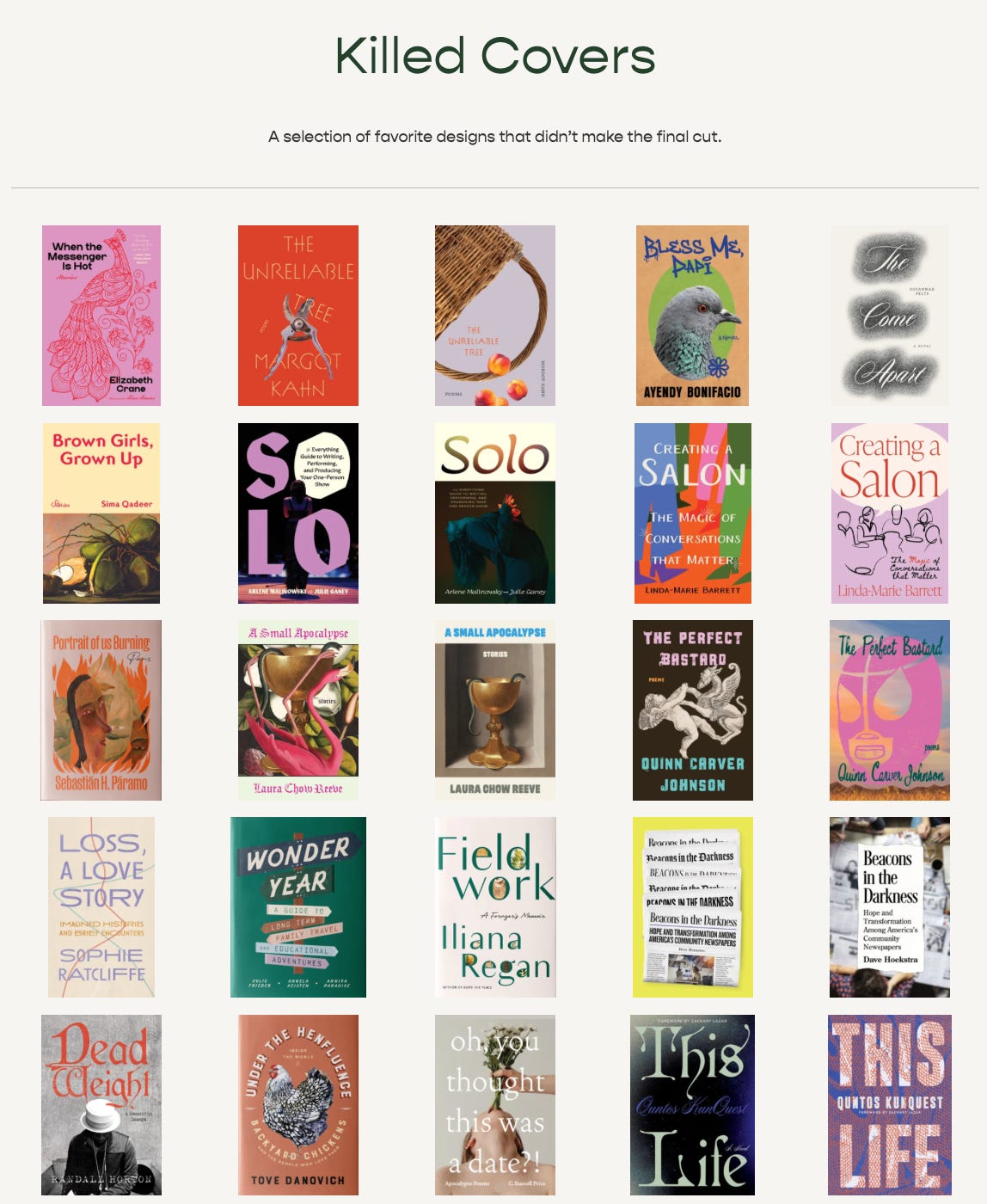
OM: One of the nice things about being a cover designer is—unless it’s a really high-priority book and it’s weird for us to do—so we still get to claim our killed covers—
EK: Yes. Let’s talk about killed covers.
OM: Yeah, those oftentimes will make their way into our portfolio as “proposed covers,” or whatever. I have conflicted feelings about that because—on the one hand—I’m like, well yeah, I was so much more proud of that cover and that’s what I wanna show other art directors who are looking for a freelancer. Like I want to signal to them that they should hire me for this type of cover. But, on the other hand, I do feel like part of the design process is figuring out all the feedback and finding a way to get everyone to sign off on it. Like, I’m proud of that? I don’t know. I tend not to include killed covers because I feel like it’s almost too in a vacuum…
JO: —like you’re cheating. <laughs>
OM: Yeah! But there are also some where I put a ton of work into them and am like, yeah, please hire me to do this somewhere where this will actually get put on book.
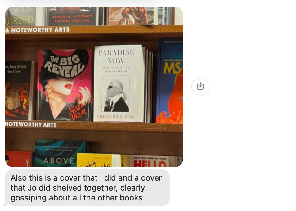
EK: No, it’s so interesting. I still keep in touch with the art director at the first indie publisher I worked at—who now just does freelance (shout out Morgan Krehbiel!)—and she has a whole section of her website that just includes her favorite killed covers. And obviously, also her approved ones, too.
EK: As someone who sees a lot of different versions of book covers that signal very different things, it almost feels like you’re seeing all the different lives that the book almost had. It makes you think.
I mean—like you were saying—the job isn’t about creating the most beautiful 6 x 9 piece of art that anyone has ever seen, it’s about getting designs past a bunch of different shareholders, etc., and also having it be something that looks impressive.
OM: <laughs> Totally.
JO: Exactly. Yeah, you have to put your ego aside sometimes, and remember that that’s the whole point of design; that’s what we’re doing here.
EK: I have a question about freelancing. I think one of the things that I’m sure is helpful but also restrictive about working in one place for a while is that—even though you have a whole new slate of books and authors and genres every season—you also get to know the editors and publishers and their quirks and taste. Do you think there’s a particular freedom that comes with freelance designing for a different publisher just because you’re not as intimately aware of who those stakeholders are? Or do you still feel like it’s a pretty similar approach to designing in-house?
JO: Olivia, you go first. I keep talking too much.
EK: Nooooo... <laughs>
OM: <laughs> I’m gonna actually make you go first, ‘cause that’s not even true.
EK: Jo, go first!
JO: I think the process is the same, but I think it’s exactly what you just said. Like, if I know the editor and I know that they don’t like the color purple and they don’t like this font, I’m already catering to one person’s specific tastes, which doesn’t totally make sense because the book isn’t just for that one person.
But yeah, I do think there is a freedom in freelance designing for a publisher and an editor that I don’t really know. I do feel a sense of like, maybe they’ll like this! Lemme try that! Maybe ‘cause I’m a people pleaser. I try to cater to what I think will get approved, but also that just makes your life easier a lot of the time! If you know what someone likes or doesn’t like, why wouldn’t you just do that? So yeah.
OM: And with in-house design, you’re oftentimes being your own art director and designer. So you’re having to ask yourself, okay, what is the direction that we should take this? while also embodying the creative role and allowing yourself to daydream. And that’s a hard thing to juggle.
So, it’s nice when you’re a freelancer because that first part is in someone else’s hands. They’re telling you what the direction is and to go and run with it. And oftentimes it also means that you’re being hired as a freelancer to work on the style that you actually enjoy more, because that’s what people are seeking you out for. As opposed to the three genres that you have to do in-house that aren’t necessarily your vibe but you know how to do.
EK: Do you think you should judge a book by its cover?
OM: <laughs>
JO: How do you not? is more the question. How can you not judge it by its cover…? You have no choice.
EK: Yeah, that’s true.
JO: <laughs> I don’t know, hmmm….
OM: I mean, I would say, for frontlist, yes. Because there is a whole industry that is geared towards getting the cover to signal what they want it to signal to the reader. So, it’s a marketing tool. There are plenty of times where I don’t really like a cover and then I read the book and I’m like, oh damn, this is so much cooler than the cover is; or sometimes the cover is so cool and you’re like, oh I’m gonna love this book, and then you start reading it and it’s drivel… <laughs>
EK: Yeah, I mean—as an editor—sometimes it’s hard to get out of my own way when reading other frontlist books just because I’m hyperaware of all the machinations of the publishing process that it becomes hard to just enjoy it as a product. Do you feel that way about covers ever, like, oh it’s so interesting that they had that type approved, or this style looks like the one thing I tried to do that didn’t get approved, etc.?
OM: Yeah. I think most of the time I’m buying a book as an object.
JO: Exactly. Me too.
OM: Like, specifically as an illustrator and cover designer. There’s been plenty of times where I’ve bought a book just because I love the cover so much and am so happy for the designer that it got approved that I just want it in my house.
JO: Yeah.
EK: Do you ever feel the opposite way about that? Like, I don’t wanna read this book because I hate this cover?
OM: I think the only scenario in which that’s happening sometimes is Tables of Contents because those books I have to read, and they already have a cover. The only other time I have to read a book is at work and they don’t have a cover, ‘cause it’s my job to put a cover on it. <laughs> So like…
JO: Well, that might lead nicely into your question, Ezra, of how much of a book do we read…
EK: Yeah, how much of a book do you read, Jo? <laughs>
JO: And my answer is just gonna be—you said something earlier that made me think of this—but I think sometimes, if you read too much, you have too much information. I’ve learned over time that, the more I read, the less I know when it comes to designing a cover. Like, I read for tone; I read for the general touchpoints.
EK: Yeah, reading the first twenty-five pages is probably more important than reading the whole thing because you’re not trying to convey the entire plot of the book on the cover. You’re trying to convey the themes and the tone.
JO: Yeah, exactly. The broad strokes.
OM: I like reading…I feel like, if it’s a novel, if I can read the whole thing, yay, but I like reading at least something.
But—to Jo’s point—if I really like something and I read it, all of a sudden my heart’s invested in it, and it skews my ability to be neutral in whatever the team chooses. Because I start having the idea that I know what the cover should look like, and then if they choose something different, I get really frustrated. ‘Cause I’m like, well, that’s not the book…
JO: Yeah, and you pull out things that you feel are important that aren’t necessarily helpful for a cover design. Like, this is the one specific pen that the character used for this. Like, it doesn’t matter, but you get obsessed. I’ve had that happen so many times where I’ve tried to convey the whole plot, or, you know, tried to illustrate every essay or something like that. And it’s just not helpful.
OM: I feel like I just wanna push back on that a little bit because—
JO: Yeah, totally—
EK: —push back! <laugh>
OM: Like yes, reading the whole book is not always helpful in the grand scheme of being good at your job, getting things approved, etc.—
JO: Oh, sure.
OM: But I also think that every once in a while it’s nice to at least be reminded that oh, I do like books. I do like getting in the weeds and feeling like I’m getting my brain scritched because I got the right pen and it got approved and someone’s gonna read it and know that that’s the right pen and think that I did a good job, or something like that.
JO: Yeah, I think it’s just picking and choosing which ones you wanna invest in, or maybe you need to invest in to get the best result. But no, I totally hear you.
EK: One of the helpful things about cover designers existing as both a part of the book process and apart from the book is that they bring a certain level of objectivity alongside their expertise. And I think you can see that when editors and authors get too involved in cover design because it’s like—and I mean, I’m guilty of this, too—if you’re working on a book for several years and you have an idea in your head of what it should look like but you’re not a designer, it can be hard to think about anything else. But a cover designer can come in and interpret it from the perspective of an involved participant that has a bit more emotional distance from the text.
Is there anything where you’re like, oh, I wish that editors and authors knew this one thing about cover design, so they would stop saying this thing to me?
OM: <laughs>
JO: Hmmm…I’m trying not to gripe.
EK: No, I mean, we can gripe later, too. I mean, we talked about how one of the hardest things with this job is balancing the vulnerable and deeply creative aspect of our jobs with the fact that this is a business with stakeholders that are making decisions way above our pay grade. The cover is understandably such an emotional thing for authors and editors—and sometimes for designers, too—but it also needs to look a certain way for books to sell so that we can all get paid money and keep our jobs.
OM: Yeah. I wish there was a button that we had the option to push—that we would only utilize when we really needed to—that said, will this sell more books? Like, we are ten rounds in and you are asking me to change this shade of red a little bit. Does this matter? Will this sell more books? You are doing my head in.
I feel like, I don’t know if it’s useful for editors to know this, but—at least in my experience—designers’ hearts can only be in it for like, one and a half rounds. And once you’ve moved on from that, I am now just trying to execute what you want me to do. I am no longer the keeper—and I think that’s something that I can probably work on.
EK: Well, that makes sense, ‘cause at a certain point you’re at a place where the editor or author are like, actually I want the hand to be positioned in this way and I want the type to be bigger and I want it to be this color, and then it stops being you designing the cover. And becomes you moving things around in service of what you think this other person thinks they want.
JO: <affirmative>. Yeah, I feel like, for authors, I would just say to try and trust the process. And, like Olivia says, if you want something changed, ask yourself why and if that really is adding anything to the cover, especially if you otherwise like looking at it.
Like, we are experts in our field just as they are in theirs. I am not going to edit their book, nor would I ever attempt that. I think because cover design is just as subjective and creative as writing is, and I suppose that there’s something about covers that allow them to be manipulated—especially in this day and age—so quickly and easily, that it becomes very tempting to do that.
And I understand I would probably be doing the same thing. But yeah, trusting the process and just letting us do our thing would be great.
OM: Having worked on two books of my own with a different publisher on the author side, it made me really appreciate the value of author care. I work at a publisher that has puts a lot of respect in author care, and I’ve done backflips—as requested by the editor—to make the author happy. And then, when I was an author, I didn’t get that same treatment, and it probably would’ve been better if I didn’t have that inside knowledge, ‘cause then I wouldn’t feel like I was getting the short end of the stick.
OM: I think that experience did allow me to appreciate so much more when editors are going to the mat for their author. Sometimes it makes our job as a cover designer harder, but, on the other hand, it’s good and nice to have an advocate in those rooms and know that that author is being heard. I think it’s helpful to try to understand the different perspectives of who’s coming into the room. And then there are also plenty of times where I just have to turn all that off and be like, my sole job right now is to just execute this. Please approve it.
JO: Yeah, you have to remember to be empathetic to that and also we’re so busy and have so much to do that you can kinda forget to have grace about the fact that this is someone’s life’s work that’s really important to them. So, I hear you on that. Good to have both sides.
EK: ‘Cause Olivia, you didn’t design your cover, right? You provided all the illustrations…?
OM: No, I did design it. And I designed the interiors as well, which I think I would probably not suggest to myself in the future. <laughs> I think, generally, what I’ve learned from both sides of that process is that it is really hard to have your heart involved in business decisions.
EK: We talked about this a lot with romcoms and thrillers, but I would love to also talk about the literary book trends. Like, you know that meme of the beef jerky that looks like a book cover? <laughs>
OM: What?
EK: It’s like, a package of beef jerky that looks like a book cover. I’ll send it to you when I find it.
OM: Okay, ‘cause I just Google searched it and all I’m seeing is a bunch of beef jerky books.
EK: No, wait–I literally have it. I’m putting it in the chat. Someone posted this and was like, why does this book look like it should be on the New York Times bestseller list?
OM: <laughs> That’s so funny.
JO: Not wrong, not wrong,
EK: But like, I mean there were the blob covers—I’m going to bleep out *********—but I feel like there was like a whole period where every single ********* book looked the same because it was all blobby. Do you feel like these cover trends are fun to analyze? Do you know when you’re in it? Like, obviously people are providing comps and there are always these waves where something is really en vogue—do you want to be a part of the conversation or the trend? Or are you trying to sidestep it?
JO: I think it’s really difficult not to be derivative of a trend. Like, if you get a brief and the three comps all have a classical painting with neon pink type, what are you supposed to do? So I guess the real challenge is trying to find ways to gently push editorial into a slightly different direction, maybe?
But I guess trends can also be fun. It’s fun to participate in a trend, but that’s not really what my goal should be. <laughs> I think it’s really hard to avoid.
OM: Yeah, similarly, I feel like the only way around it—or through it—is trying to provide comps that are skirting the brief enough that you’re providing the team the option to go a different route. It might be some designer or art director’s job somewhere, but it’s certainly not my job to dictate what the cover should look like.
JO: It’s tricky because I don’t necessarily want my name on something that looks exactly like something else that someone else has already done. ‘Cause nobody wants to copy anybody. But, like Olivia says, if you can gently get them to try something else or skirt that particular concept, then I think that’s probably the better course.
EK: I mean, from an editorial standpoint, that’s actually something I’ve been struggling with. Obviously there are original ideas and then sometimes it just feels like there are so many things in the zeitgeist that are hitting the same points. And it’s like—has everything already been done?
Have you seen these two covers? Basically there are two literary fiction titles coming out in the next month or so that both use the exact same artwork. And obviously that’s not something anyone would’ve been able to anticipate, but it also feels like the final evolution of the classical art trend.
OM: Yeah, I mean, if it’s antiquity it’s also kind of hard because there’s oftentimes no rights holder and no licensing body; it’s just public domain. So there’s no one to tell you like, hey, by the way, this has already been licensed for something. You just run that risk if you’re using public domain art.
JO: I’m surprised that one of them didn’t change it.
OM: I mean, it’s a cool treatment.
JO: It is crazy in this day and age where we can access so much that two people would pick the same thing.
EK: Oh, I was gonna say—’cause I know we’ve been talking for a while—do I wanna talk about AI? I don’t really know if I care…
OM: I–
EK: Let’s not…
OM: I don’t fucking care.
EK: We’ll talk about it tonight. We’ll talk about it at drinks tonight.
OM: Yeah, it’ll just put me in such a bad mood.
EK: No bad mood! Let’s go fun mood.
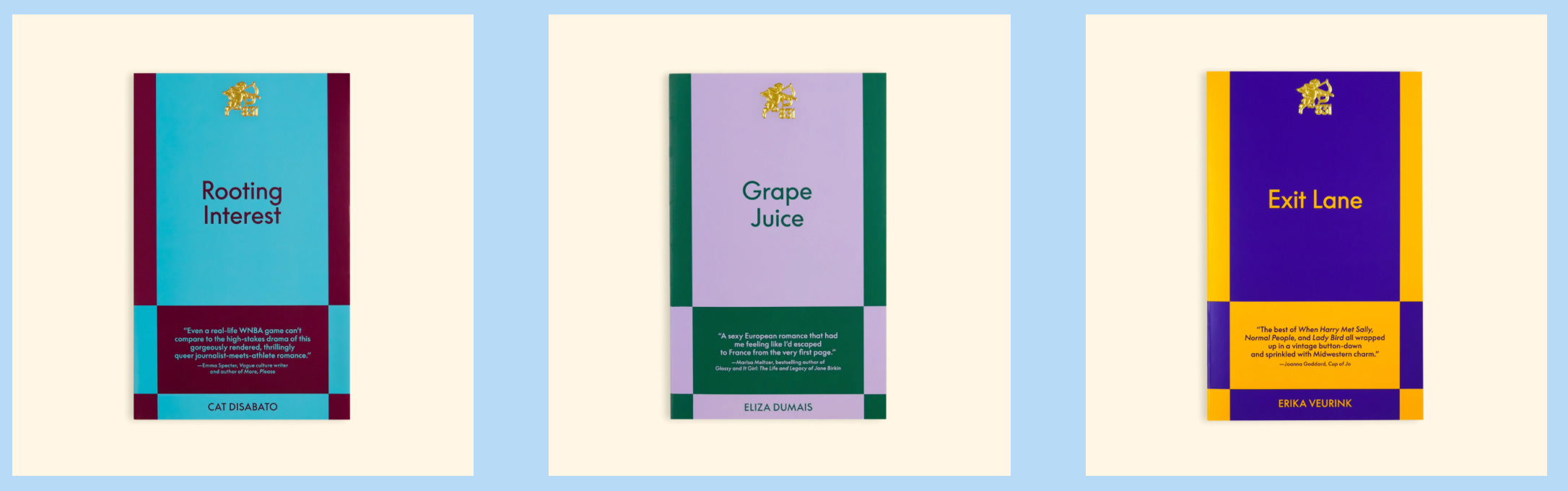
Okay, I was gonna ask y’all about your galley brags—and you can just send these to me so you don’t have to describe them out loud—but I also want to know what your personal cover brags are; covers that you care about so much and are so proud of?
OM: Awwww.
EK: And the second question is: are there any forthcoming books that have covers where you’re like, oh that is so cool and I just wanna shout it out?
JO: Oh yeah. I’m sure we can find plenty.
EK: And I know Olivia, because you do Tables of Contents, too—which you can talk about if you want—but you’re probably also getting sent more galleys…
JO: I was gonna say—I would love to have galleys sent to me…
OM: Yeah, I feel like Tables of Contents is the only connection I have to galleys outside of laying out the back type. <laughs>
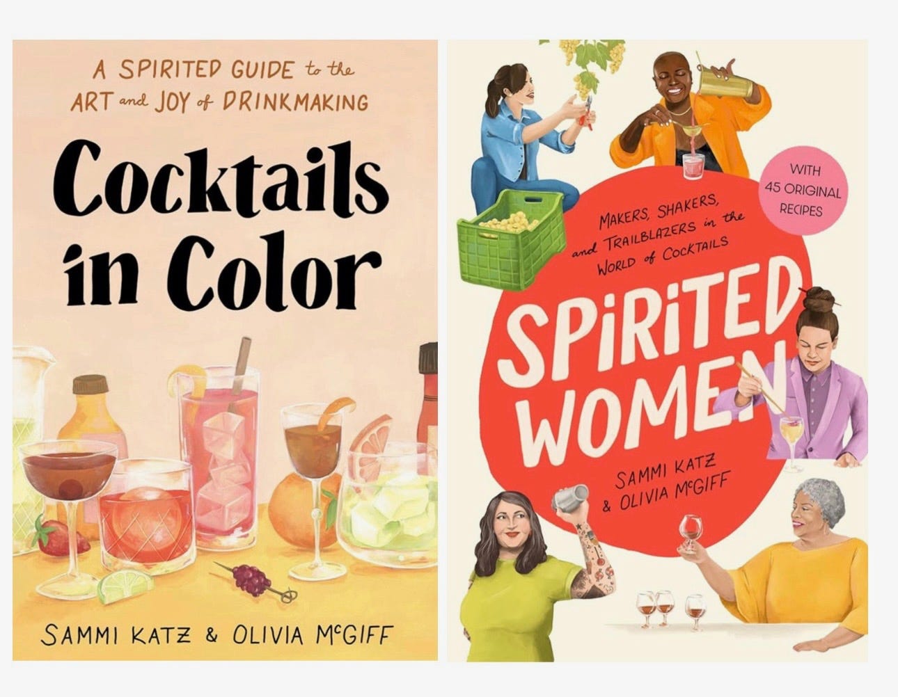
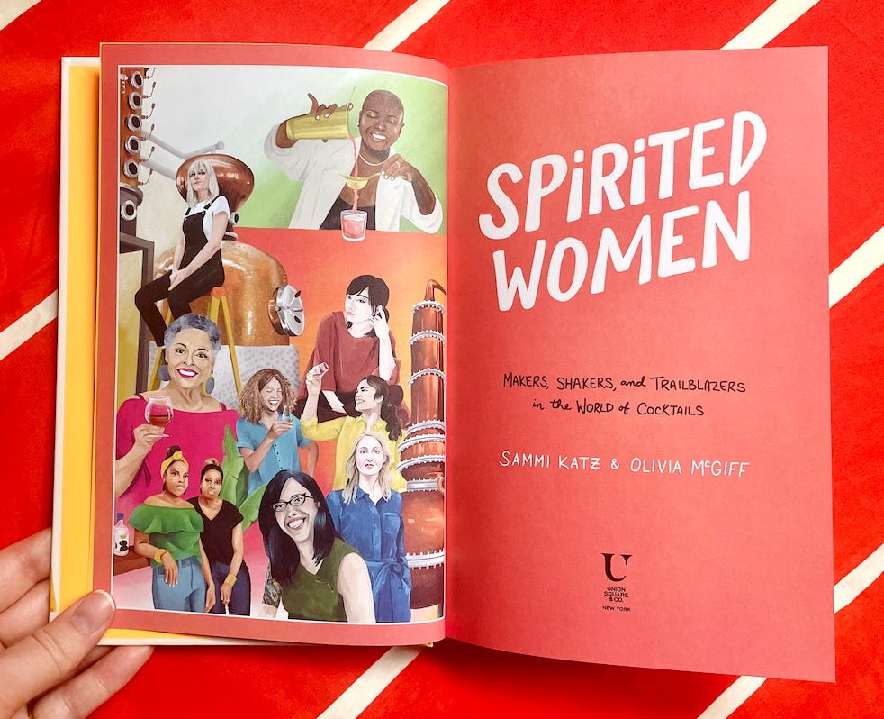
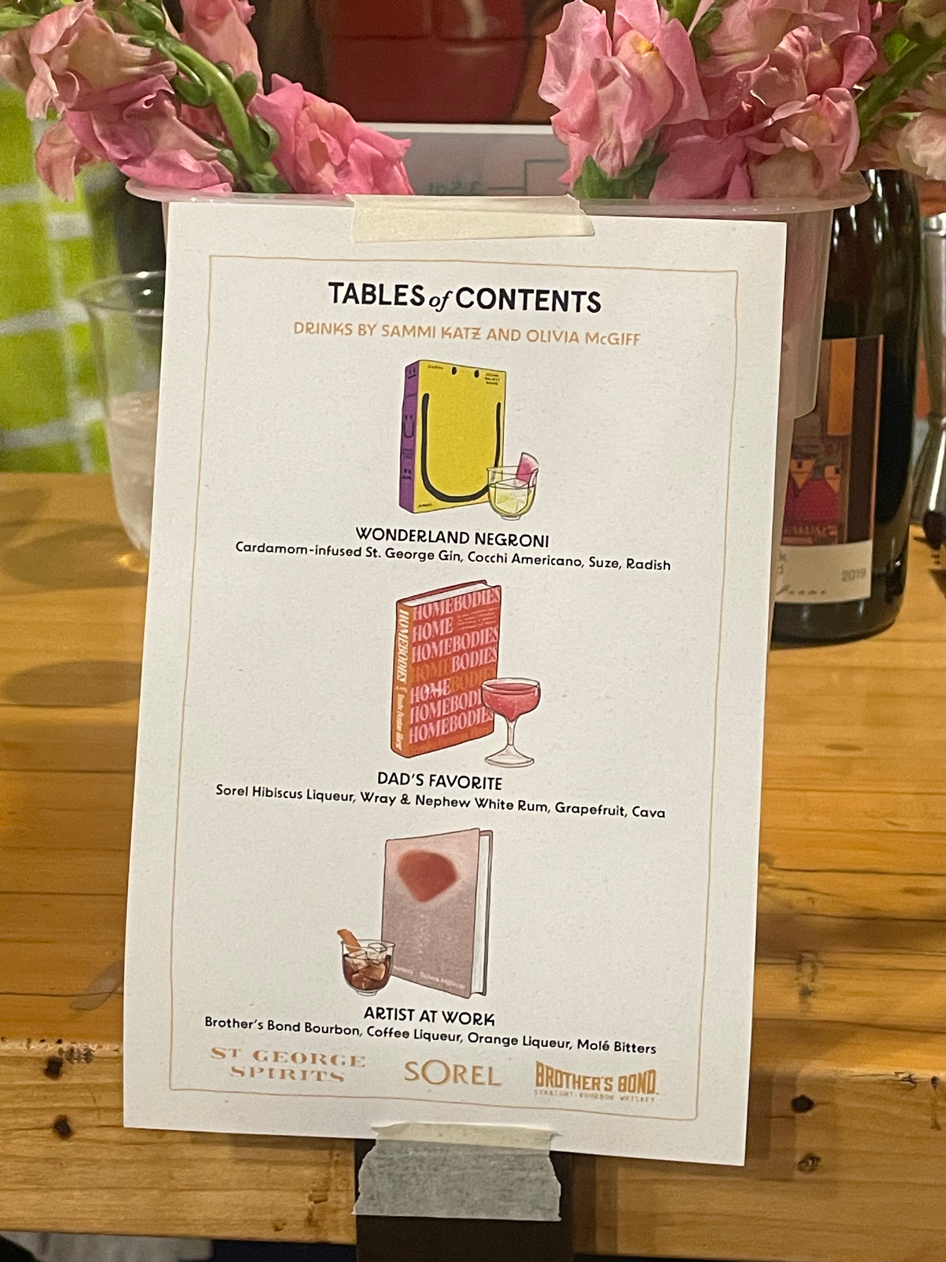
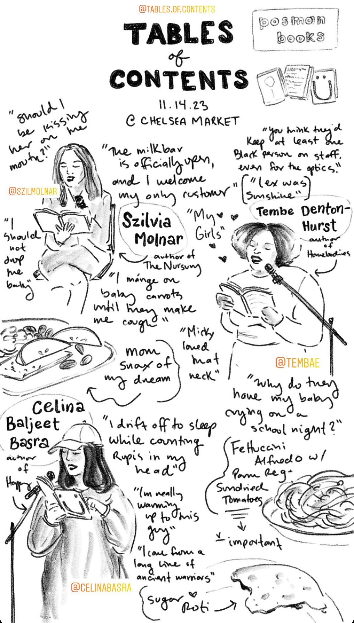
Yes, so Tables of Contents is a monthly literary dinner series that features three contemporary authors reading new works. It’s all run by a chef. The readings mention food, the chef cooks the food, and then me and my creative partner do the cocktails for it. We do cocktails inspired by the books.
OM: And I feel like—in the last couple of years—there’s definitely been times where I get a galley for something where I’m like, ooh, I feel so cool I have that I have Stag Dance, or whatever it is. <laughs> It definitely feeds a part of my ego that is probably better left unfed where I feel cool and in the know. And it’s probably better that I don’t…
JO: Stay on this side with me where you don’t know what’s happening. Wait until you see it in a store and are like, oh, wow…
OM: Yeah, I think it’s easy for me to sometimes confuse my role in everything as being too involved in marketing or how things get publicized, or whatever. It’s ultimately better when I’m not keyed into that stuff for my own mental health and ability to engage with books and publishing in a way that I actually enjoy.
But I do love Tables of Contents, and I love being a part of it. I love being able to read books through a very specific lens, which is food and drink.
EK: Is it Sammi—your writing partner, Sammi Katz—who creates the cocktails from the readings? Or is that a collaborative effort?
OM: It depends on how much time we have that month, but yeah. In an ideal setting it’s collaborative; one of us will read the book and report to the other one on what foods are mentioned; where the passage is set geographically, ’cause that often will inform liquor choice; and tone. And then we’ll oftentimes R&D them together and touch base with the chef to make sure that we’re not both making a food and drink version of Pistachio Kulfi, which has happened before. <laughs>
EK: Olivia, literally how do you have time to do any of this?
JO: She doesn’t. She makes the time.
OM: Yeah, I don’t <laughs>. Yeah, I think having come originally from theater and working in a lot of different roles there, it makes me happy to have different roles in publishing. It just makes me feel more myself and not so pigeonholed.
EK: Yeah. Aww, okay. Well, I’ll ask one last question and then you can send me your favorite cover brags, but—in terms of ego—when you go into a bookstore are you ever like, ummm, so I actually designed this cover…
JO: <laughs>
EK: Or, when you see people posting galleys on Instagram and you did the design and you’re seeing people react to it, do you feel like you gotta keep your ego in check or is one of the fun pleasures of the job being like, everyone says this book cover is so beautiful and they don’t know that it was me…
OM: <laughs>
JO: It’s more if I see someone reading something that I’ve worked on, I wanna talk to them about it. I don’t necessarily wanna brag about it; I just wanna talk about it. It’s nice to see things out there that you made, but you gotta keep your ego in check.
EK: <laughs>
JO: I mean, we’re so lucky that we do get to go into a bookstore and see our work, that we get a 3D object out of our job every month. So yeah, I just think being humble is always best.
EK: Stay humble. Okay, any final words on that, Olivia? Or general thoughts you want to get on your soapbox and talk about?
OM: Hmmm. I would say to authors—if they really love their cover—it’s cool to mention your cover designer who made that thing. And I would say that to publishers as well. Like, there are a couple of publishers who, when they do a cover reveal, actually mention who on their design team did it. We work hard, and it’s so appreciated when authors mention who worked on their cover, and it’s also helpful as an art director because then I get to see who made it and I don’t have to track them down…
EK: …from the inside flap…
OM: No, exactly.
EK: Any final thoughts, Jo?
JO: I second that motion.
EK: Well, when you send your favorite covers and stuff, I would also be curious if there are any other cover designers working today where you’re like, oh, I’m obsessed with their shit.
JO: Mmhm, can do. One of them is on the call.
OM: Ohhhh my godddd–
EK: It’s me!
OM: <laughs>
JO: Your next foray.
EK: Yes, I totally need more things to do. Okay, well thank you guys so much again for your time. I’m so excited to see you guys later.
OM: Yay, okay. See you soon.
JO: See you, bye!
Olivia’s Galley Brags (Jo is too proud to brag <3)
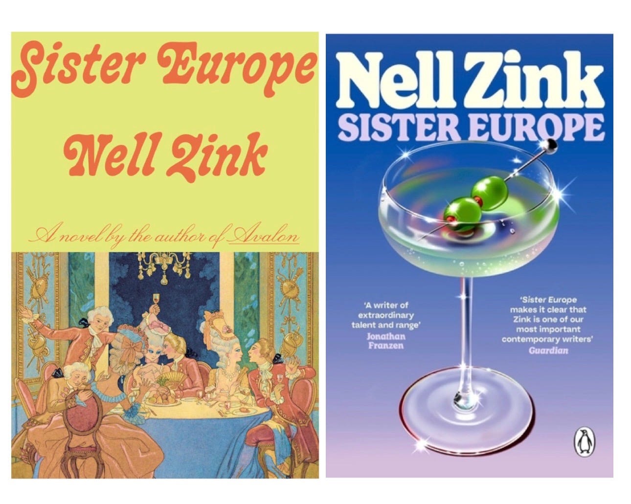
Cover Crushes: Both the US and UK covers for SISTER EUROPE give me immense joy. And also look like completely different books. But I would read both! I’m a bit of a whore for creamy/bold color. Not shockingly, I have a total crush on designers who are also illustrators who are able to bring their whole bag of tricks to the table and get it approved.
UK designer Holly Ovenden:
Vivian Rowe at Ecco:
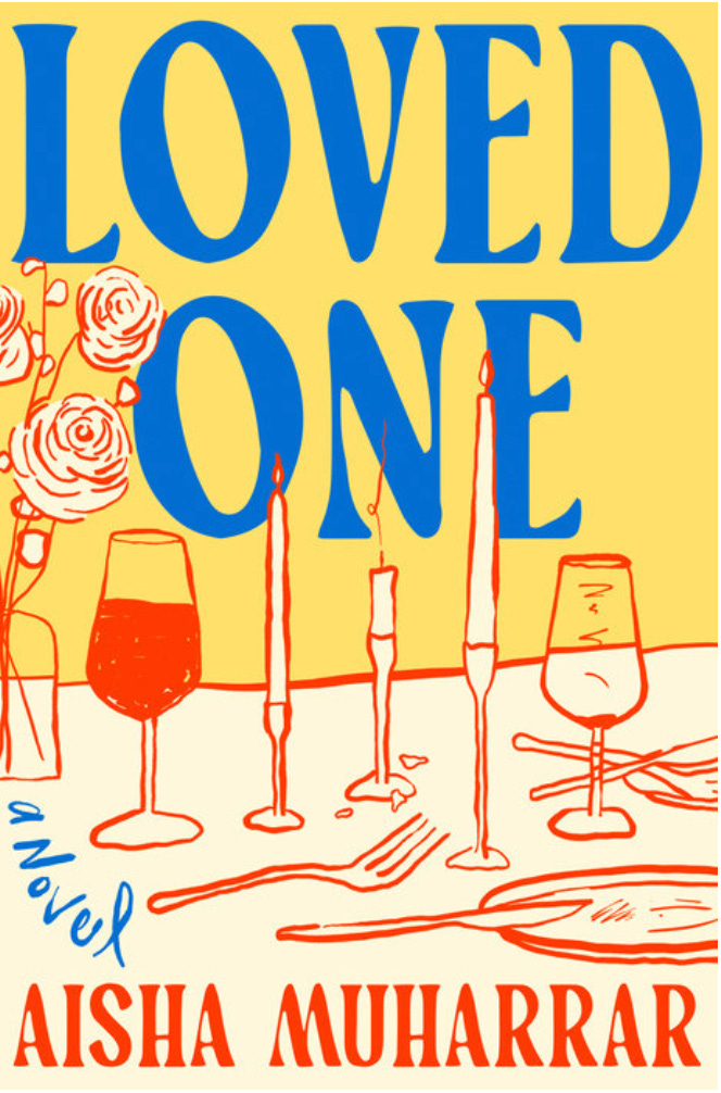
Elizabeth Yaffe’s cover for LOVED ONE is so damn yummy.
Also I have a crush on Jo and every cover she’s ever done.
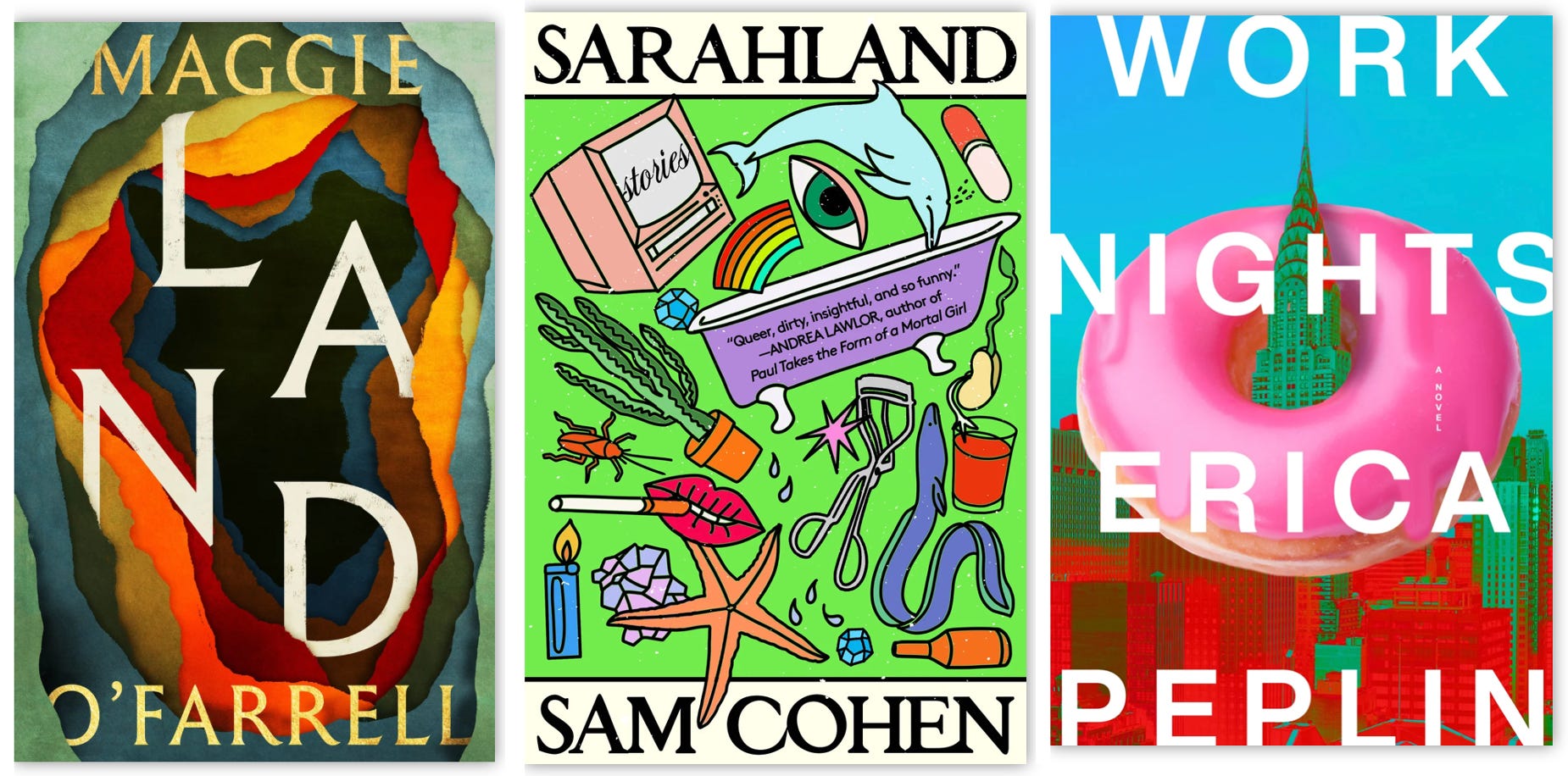
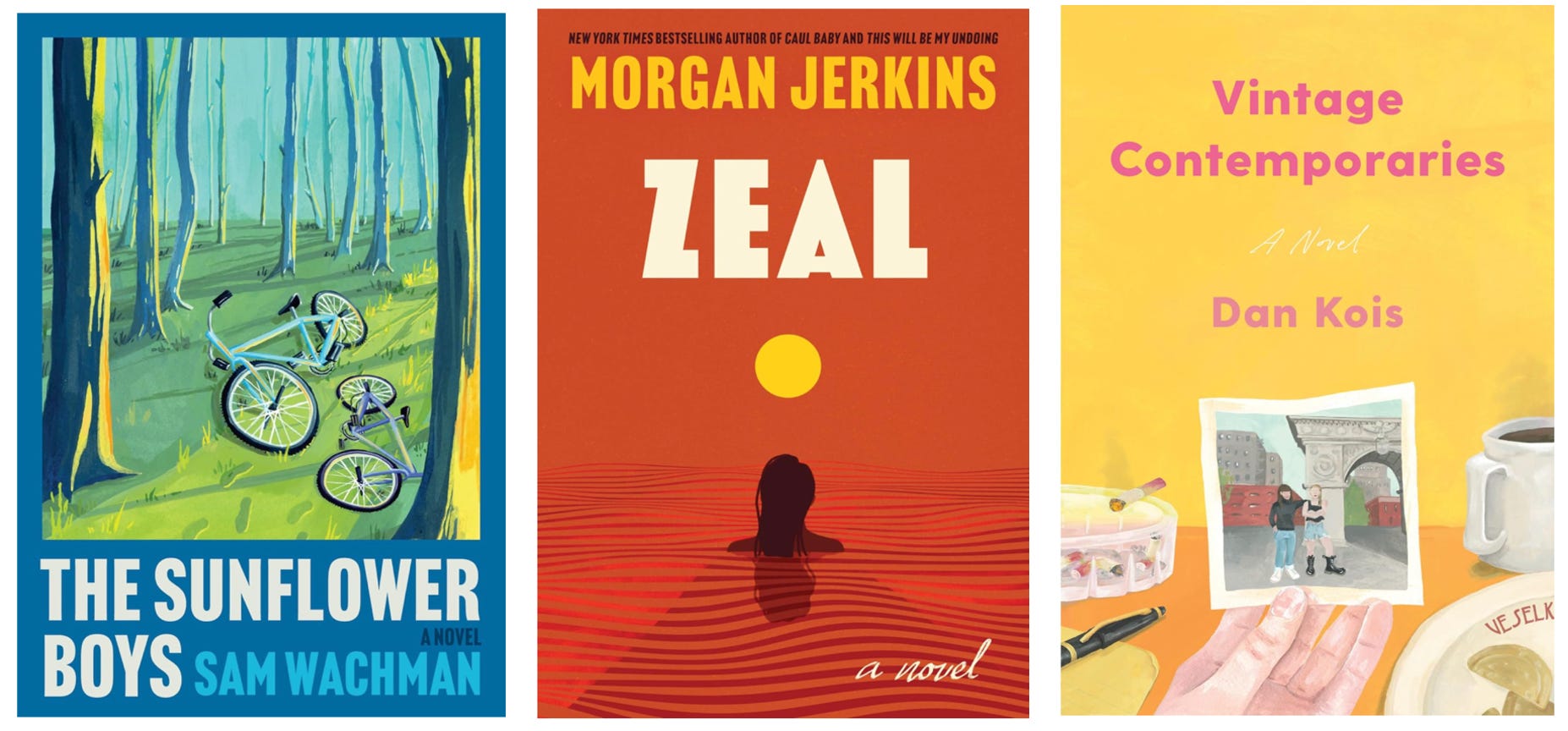
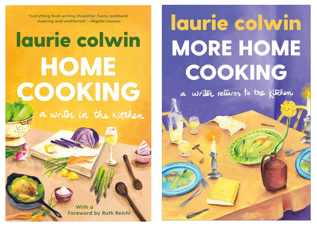
Cover Brags: THE SUNFLOWER BOYS, ZEAL, VINTAGE CONTEMPORARIES, the Laurie Colwin backlist is really dear to me, specifically HOME COOKING and MORE HOME COOKING.
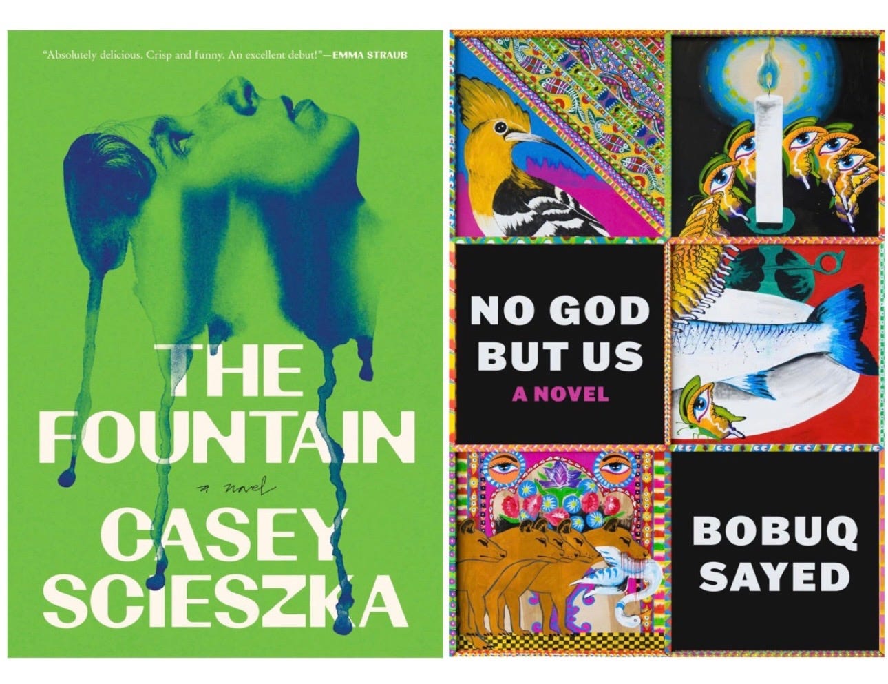
Galley Brags: I snagged an early copy of THE FOUNTAIN from the office and am really enjoying it! And I promise I’m not glazin’ you here, but I’ve truly never enjoyed reading a manuscript for work more than NO GOD BUT US. The opening scene is forever seared into my mind, and I’ve made innumerable people in my life read the first few pages. Can’t wait for it to hit readers’ hands :)
The Fitzcarraldo and & Other Stories covers strike me as a bit of an A24-style marketing move. They're saying, "You trust us as a publisher, first and foremost, and we think you'll like this book."
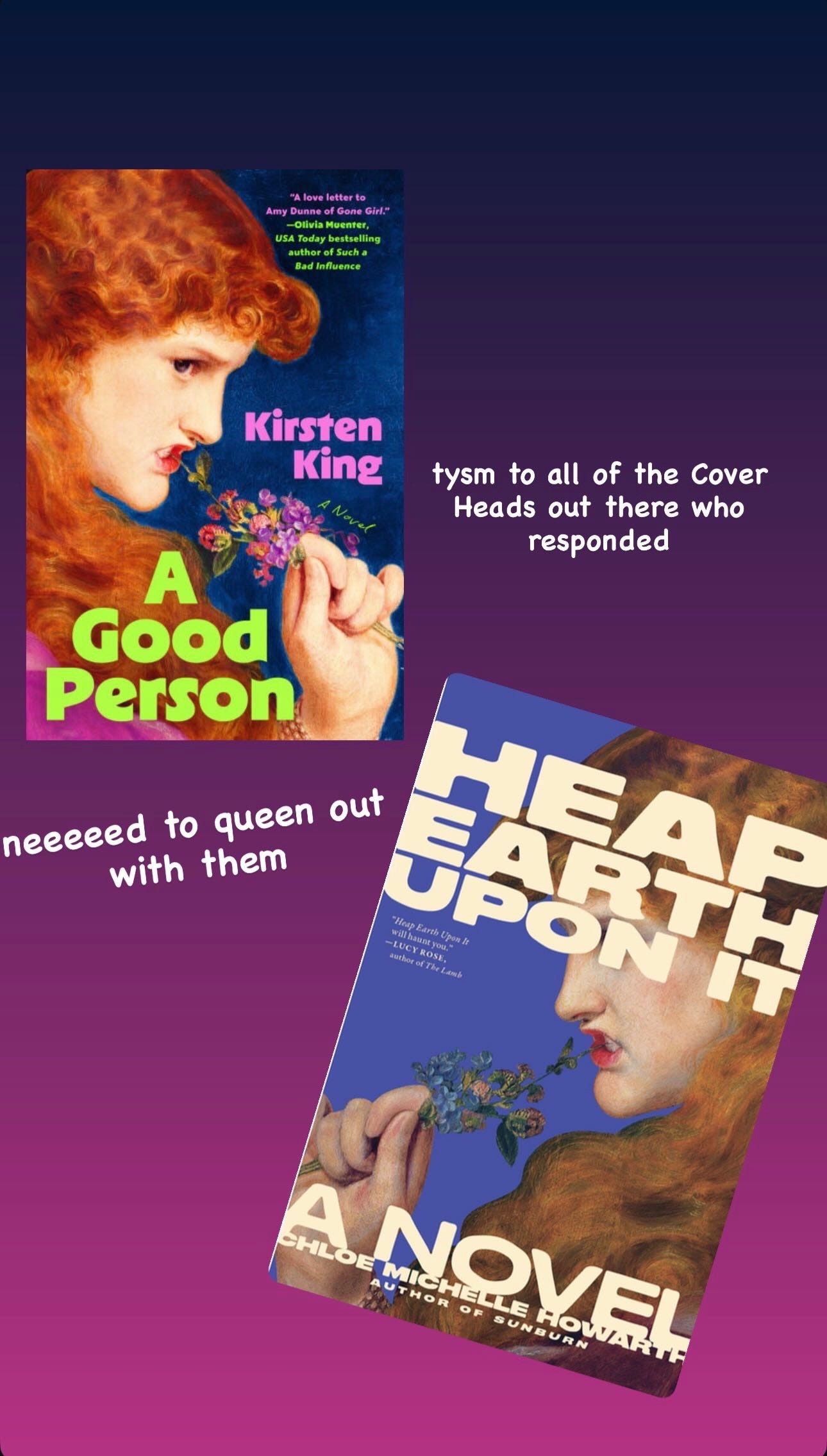
Steph saw my story yesterday and told me to come talk to you! I even saw a reference to the painting from A Good Person & Heap Earth Upon It in the body/text of Spoiled Milk by Avery Curran (another new release) and I’m dying to know why that particular painting is having such a moment!